Alexander Lam
Popups can increase conversions or drive customers away. Learn the 11 most common popup mistakes that hurt conversion rate, user experience, SEO, and lead capture, plus practical ways to build smarter, higher-converting popups that shoppers actually engage with.
Key Takeaways
→ Timing matters more than the offer. Trigger popups based on visitor behavior and intent, not immediately after the page loads.
→ Relevance beats volume. Personalized messages, thoughtful timing, and the right popup format consistently outperform generic offers shown to everyone.
→ Measure business impact, not opt-ins. The best popups improve conversion rate and revenue while protecting user experience, page performance, and SEO.
Why Popups Still Matter for Conversion Optimization
Popups get a bad rap. Most people think of them as the annoying box that covers a page before you’ve even scrolled.
But that’s a failure of execution, not proof that popups don’t work.
Done right, a popup is still one of the fastest ways to boost conversion rate, grow your email list, and guide a shopper toward the next step.
The trick is understanding when a popup helps and when it just gets in the way.
Why popups are not inherently bad
Popups aren’t the enemy. Bad timing is.
A popup that shows up when a shopper actually wants more info feels like help, not an interruption.
Think of it like a store clerk. Nobody minds a clerk who steps in right when you’re stuck deciding between two products. Everybody minds one who blocks the door the second you walk in.
Successful popups share a few common traits:
- They support conversion, not interrupt it. The best popups improve conversion rate, lead capture, and user experience by appearing when visitors are most likely to engage.
- They match the visitor’s intent. A modal overlay can work well for high-intent actions, while nonmodal overlays are often better for sharing relevant content without disrupting browsing.
- They prioritize context over frequency. Showing more popups doesn’t increase conversions. Showing the right popup at the right moment does.
This guide covers the 11 most common popup mistakes that quietly reduce conversions and how to fix each one.
Mistake #1: Showing Popups Before Visitors Have Any Intent
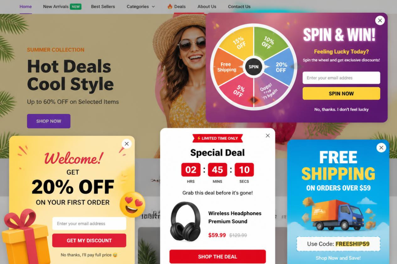
The fastest way to lose a visitor is to interrupt them before they’ve had a chance to engage with your site. An entry popup that appears the moment a page loads asks for something before it has earned the visitor’s attention.
Here’s why that backfires, and what to do instead.
Why immediate entry popups hurt user experience
Imagine walking into a store and being asked to join the loyalty program before you’ve even looked at a product. That’s exactly how an immediate popup feels.
Visitors need time to understand what you offer and decide whether it’s relevant. Showing a popup too early creates friction at the very moment you’re trying to make a good first impression. Instead of encouraging engagement, it often pushes visitors away before they’ve explored your site.
Why popup timing matters more than the offer
The best offer won’t convert if it appears at the wrong time.
Recent analysis of 1.24 billion popup displays found that popups shown after a 6 to 10 second delay converted better than those displayed immediately. Giving visitors a few seconds to browse helps build intent before asking them to subscribe or claim an offer.
The goal isn’t to wait a fixed number of seconds. It’s to trigger a popup after the visitor has shown interest.
Better triggers than an immediate popup
Behavior-based triggers are usually more effective because they align with what the visitor is already doing.
- A timed delay gives visitors a chance to browse before seeing an offer.
- A scroll-triggered popup appears after someone has engaged with the page.
- Exit-intent popups provide one last opportunity to recover abandoning visitors.
- A click-event popup, such as opening after someone selects a “Size Guide” or “Shipping Information” link, feels like a natural extension of the experience instead of an interruption.
Each trigger waits for a signal of intent rather than assuming every visitor is ready to engage.
When entry popups still make sense
Entry popups aren’t always the wrong choice.
If every visitor needs to see the same information, such as a legal notice, age verification, or a major sitewide promotion, showing a popup immediately can be justified.
Keep it concise, make the close button obvious, and let visitors continue browsing without unnecessary friction. If a popup interrupts the experience, it should do so for a good reason.
Mistake #2: Interrupting Critical Tasks
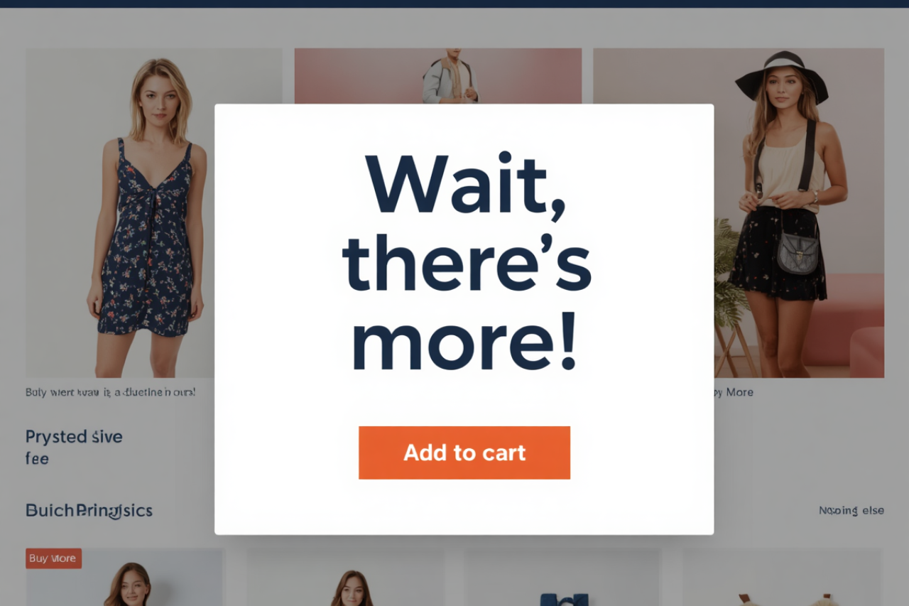
Not every moment is the right time for a popup. When a shopper is comparing products, reviewing their cart, or completing checkout, their attention is focused on one goal: finishing the purchase. Interrupting that flow creates unnecessary friction.
Why modal overlays increase abandonment
A shopper who reaches checkout has already invested time choosing a product. A popup that suddenly asks them to join a newsletter, claim a discount, or browse another offer shifts their attention away from completing the purchase.
Research from Baymard Institute shows the average ecommerce cart abandonment rate is about 70%, and many abandonment issues are caused by avoidable checkout friction and interruptions.
The closer a visitor is to converting, the fewer decisions you should ask them to make.
Avoid showing modal overlays when visitors are:
- Completing checkout or entering payment details.
- Reviewing their cart.
- Comparing products or selecting options like size or color.
- Using navigation or search to find products.
These are high-intent moments. Every unnecessary interruption increases the chance that a shopper loses focus or abandons the purchase.
When a nonmodal overlay is the better choice
Sometimes you still need to communicate with the customer. The key is choosing the right format.
A nonmodal overlay, such as a small slide-in or sticky banner, keeps the message visible without blocking the page.
For example, displaying “You’re $15 away from free shipping” in the corner can encourage a larger order while allowing shoppers to continue checking out uninterrupted.
Protect high-intent moments
Map your customer journey and identify the points where visitors are most likely to convert. Cart review, checkout, and product decision pages should stay as distraction-free as possible.
Save promotional popups for earlier browsing stages, or trigger them after meaningful engagement.
As shoppers move closer to purchasing, your priority should shift from capturing attention to removing friction.
Mistake #3: Treating Every Visitor The Same
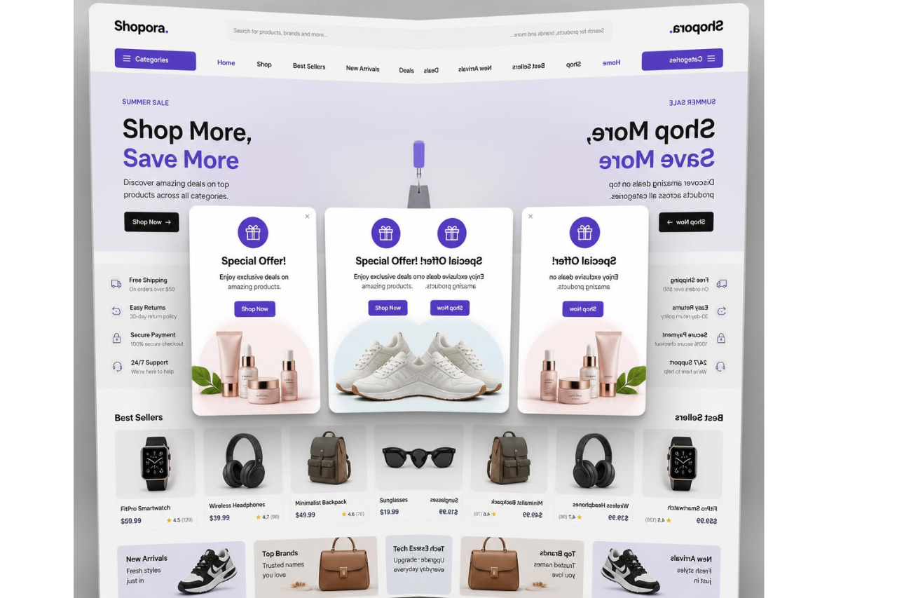
A popup should match who the visitor is and what they’re trying to do. Showing the same message to everyone ignores intent, and that’s where conversions start to drop.
Why generic popups convert less
A first-time visitor isn’t looking for the same thing as someone who’s already purchased from you.
New visitors often need reassurance before they’re ready to subscribe or buy. Returning visitors already know your brand and are more likely to respond to personalized recommendations, loyalty rewards, or back-in-stock alerts.
Repeating the same “Get 10% off” popup to every visitor quickly loses its impact.
Start with simple audience segmentation
You don’t need advanced personalization to see better results. Start by separating visitors into a few basic groups:
- New visitors
- Returning visitors
- Existing customers
- Cart abandoners
Most popup tools for Shopify and other ecommerce platforms support these rules out of the box.
Personalize based on behavior, not assumptions
Once you’ve covered the basics, tailor popups to what visitors are actually doing.
Someone arriving from an Instagram ad promoting a new collection should see an offer related to that collection. Someone who has viewed multiple products in the same category may be ready for a buying guide, comparison chart, or limited-time offer instead of a generic newsletter signup.
The more relevant the popup, the more likely visitors are to engage.
This isn’t just best practice. Zendesk’s 2025 CX Trends report found that 75% of customers expect businesses to personalize experiences based on previous interactions.
A personalized popup doesn’t have to know everything about a shopper. It simply needs to reflect their context, whether that’s where they came from, what they’ve viewed, or how they’ve interacted with your site so far.
Mistake #4: Offering Discounts Instead of Value
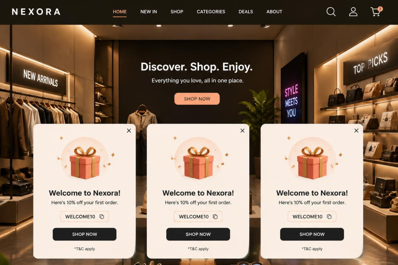
Discounts can increase conversions, but relying on them for every popup comes at a cost. If visitors learn they’ll always get 10% or 15% off, many will simply wait for the next offer instead of buying at full price.
Why discounts aren’t always the best incentive
A discount only appeals to visitors who are already motivated by price. Many shoppers are still looking for information, reassurance, or confidence before they buy.
Instead of leading with a coupon, consider offering something that helps them make a decision, such as a buying guide, size chart, product quiz, or early access to new products. You still capture the lead without immediately reducing your margins.
Match the offer to the visitor’s intent
The best popup isn’t always the one with the biggest discount.
Someone reading a buying guide may be more interested in helpful content than a coupon. Someone who has spent several minutes on a product page or reached the cart may respond better to free shipping or a limited-time incentive.
The closer the offer matches the visitor’s intent, the more likely it is to convert.
Build your lead capture strategy around the customer journey
Different visitors need different reasons to engage.
Early in the buying journey, focus on education and trust. As purchase intent increases, introduce stronger incentives only when they’re likely to influence the final decision.
Discounts should be one tool in your conversion strategy, not the default for every popup.
Mistake #5: Asking for Too Much Information
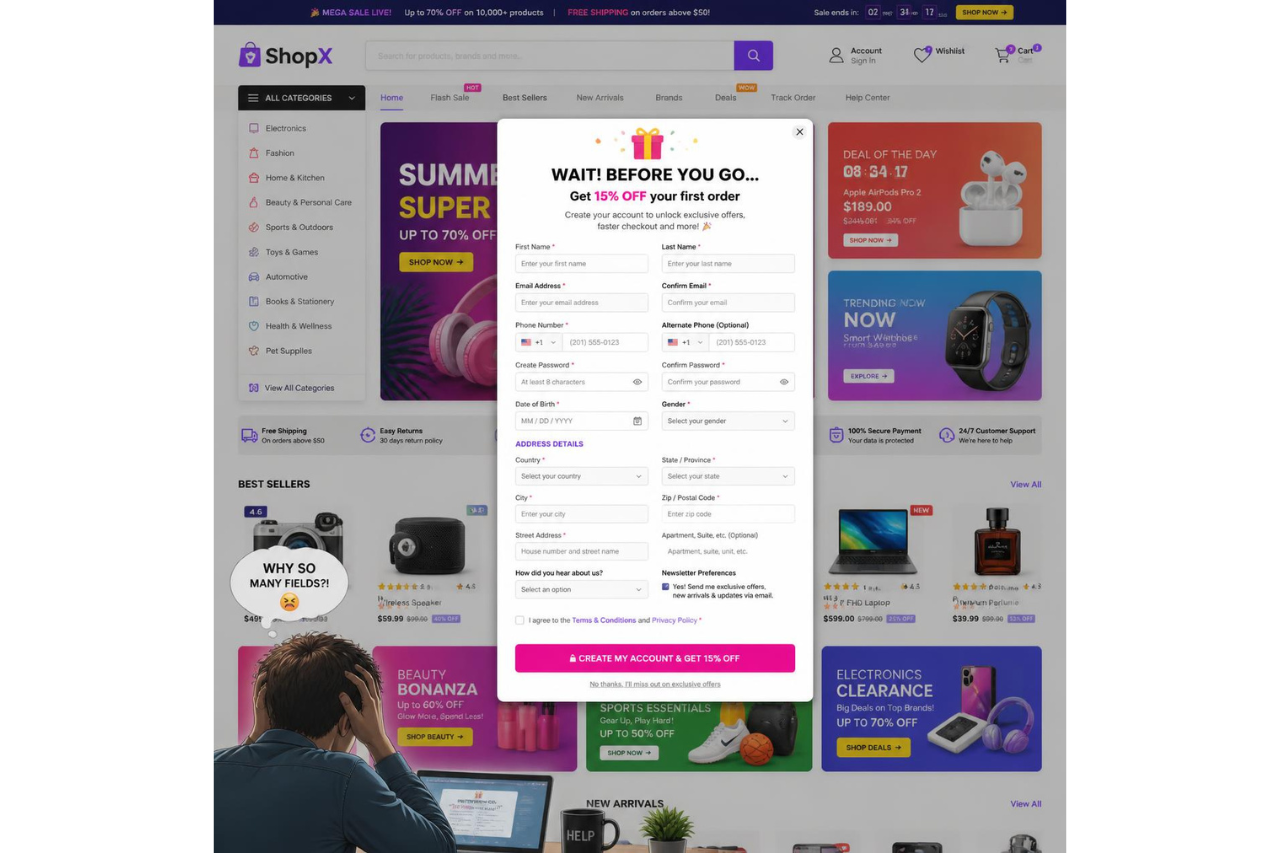
Every field in your popup form adds friction. If someone has to stop and think before completing it, they’re more likely to leave without submitting it.
Keep the first interaction simple
For most email capture popups, an email address is enough.
Asking for a phone number, birthday, company name, or other personal details before you’ve built trust often reduces completion rates. Baymard Institute’s checkout research found that minimizing the number of form fields improves usability because users perceive shorter forms as less effort.
Collect additional information later, after the relationship has started.
When multi-step forms work better
If you genuinely need more information, don’t ask for it all at once.
Breaking a longer form into smaller steps can make it feel less overwhelming.
HubSpot recommends multi-step forms for complex lead capture because they reduce information fatigue and improve completion rates compared to presenting every field on a single screen.
Reduce friction wherever possible
Good form design makes completing a popup almost effortless.
Keep required fields to a minimum, use clear labels, make the close button easy to find, and optimize the experience for mobile. The easier the popup is to complete or dismiss, the more likely visitors are to stay engaged with your site.
Mistake #6: Ignoring Mobile Popup Experience
Most ecommerce traffic now comes from mobile devices, so every popup should be designed for a small screen first. A desktop popup squeezed onto a phone often creates more frustration than conversions.
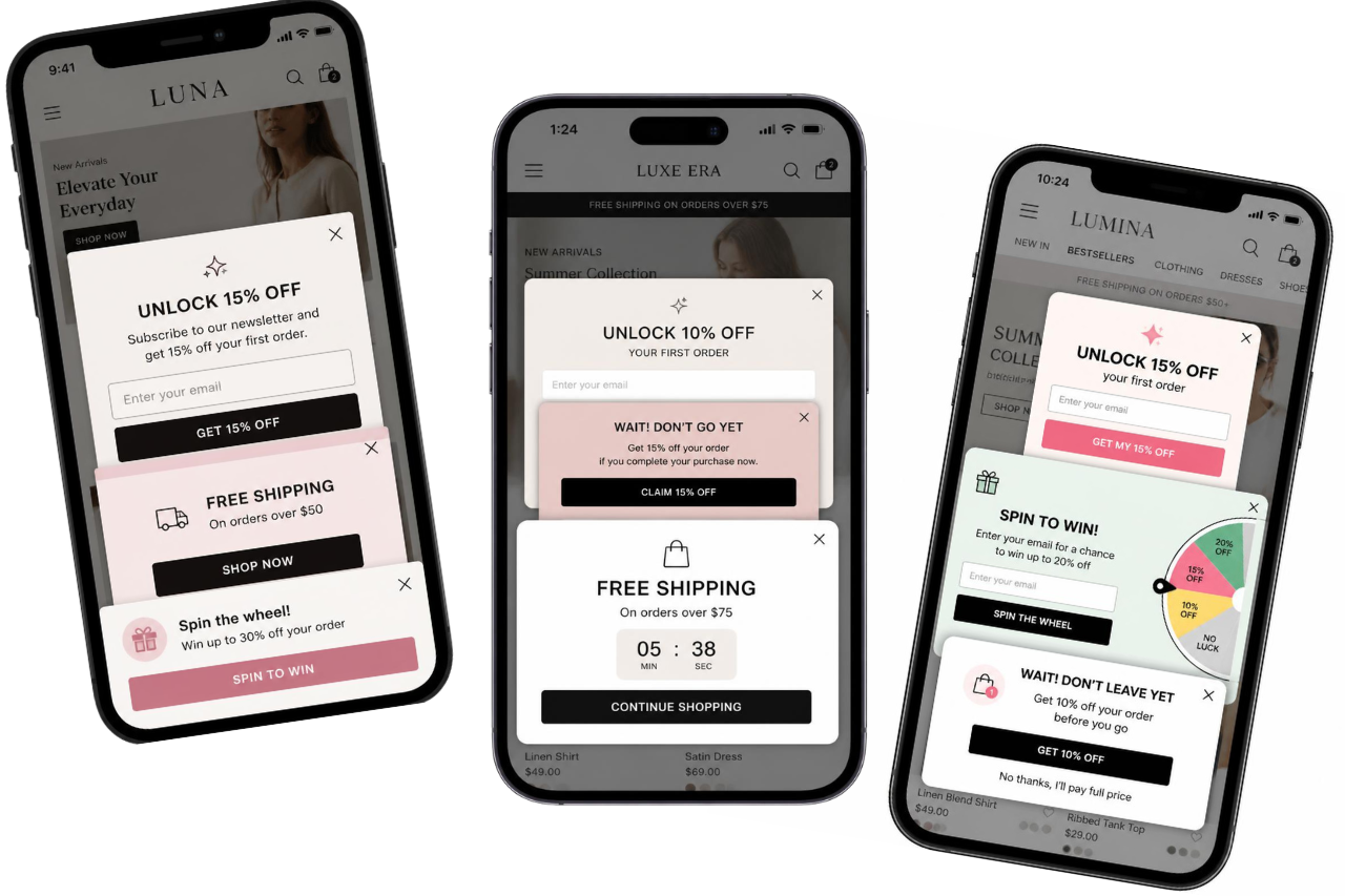
When designing mobile popups, follow these principles:
- Don’t block the page immediately. Google recommends avoiding promotional popups that cover the main content as soon as visitors arrive from Search. Instead, use banners or smaller overlays that let people access the page first.
- Keep interactions effortless. Use short forms, large tap targets, and make the close button easy to find without scrolling. If dismissing a popup feels difficult, visitors are more likely to leave than engage.
- Test on real devices. A responsive layout isn’t enough. Check every popup on actual phones to make sure text is readable, buttons are easy to tap, and nothing overlaps or disappears.
- Choose lighter popup formats when possible. Sticky bars, slide-ins, and other nonmodal overlays can promote offers or encourage email capture without covering product images or interrupting the shopping experience.
A good mobile popup should feel like part of the page, not an obstacle standing between visitors and what they came to do.
Mistake #7: Using the Wrong Popup Type
Not every popup format fits every goal. Picking the wrong one is like using a hammer to turn a screw.
| Popup Type | Best Used For | Avoid Using It For |
| Exit-intent popup | Recovering abandoning visitors with a cart reminder, offer, or last-minute incentive | Greeting new visitors or interrupting browsing |
| Scroll-triggered popup | Visitors who have engaged with a product page, article, or collection | Short pages where visitors haven’t had time to show interest |
| Click-event popup | Size guides, back-in-stock alerts, product details, or other visitor-requested actions | Promotional offers that interrupt browsing |
| Modal overlay (Lightbox) | High-priority announcements, email capture, or limited-time campaigns | Checkout, product comparison, or other critical tasks |
| Sticky bar or banner | Free shipping reminders, announcements, or ongoing promotions | Messages that require immediate action or detailed forms |
| Inline offer | Content upgrades, buying guides, and contextual recommendations within the page | Time-sensitive promotions that need maximum visibility |
There’s no single “best” popup. An exit-intent popup works because the visitor is already leaving. A scroll-triggered popup works because the visitor has shown interest. A click-event popup works because the visitor chose to interact.
Mistake #8: Weak Copy and Unclear Calls to Action
The right popup at the wrong time won’t convert. Neither will the right popup with the wrong message.
Visitors decide in seconds whether a popup is worth their attention, so every word needs to answer one question:
What’s in it for me?
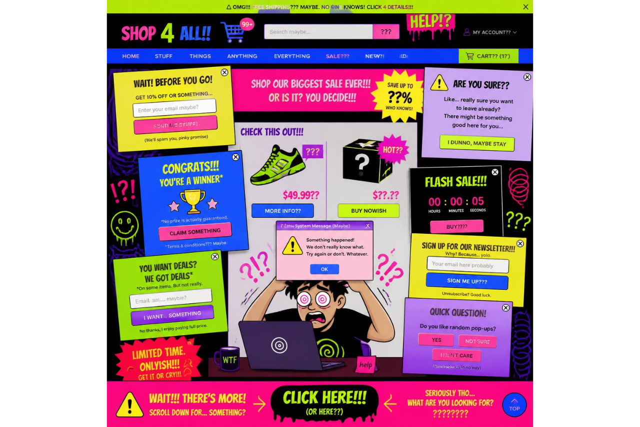
Write copy that gives visitors a reason to act
Generic messages like “Sign up for our newsletter” or “Submit” don’t communicate value.
Instead, focus on the benefit. Tell visitors exactly what they’ll receive and why it’s worth sharing their email address.
For example:
- Get 10% Off Your First Order is stronger than Subscribe.
- Get My Free Size Guide is more compelling than Download.
- Notify Me When It’s Back in Stock is clearer than Sign Up.
Build urgency without misleading visitors
Urgency can increase conversions, but only when it’s genuine.
Use countdowns, limited stock messages, or time-sensitive offers only if they’re accurate. False scarcity and fake timers are examples of dark patterns that damage trust and may discourage repeat purchases.
Match the message to the page
The best popup copy reflects what visitors are already doing.
Someone reading your shipping policy may need reassurance or live chat. Someone viewing a product page may respond better to a back-in-stock alert, free shipping reminder, or limited-time offer.
A popup feels far more helpful when its message matches the visitor’s intent instead of interrupting them with a generic promotion.
Mistake #9: Showing Too Many Popups
A popup should attract attention, not compete for it. When visitors see multiple popups in a single session, they quickly learn to ignore them.
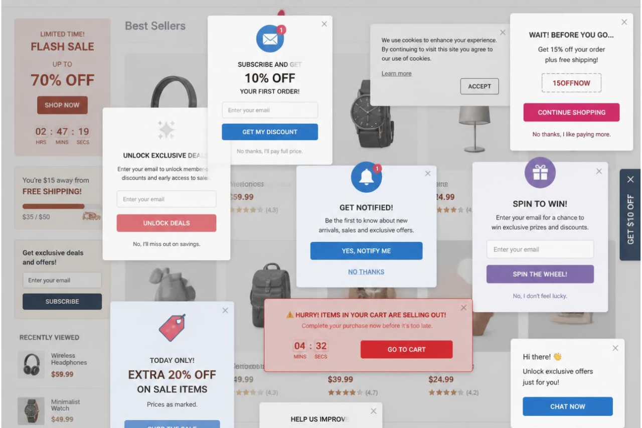
Limit how often visitors see popups
Showing the same popup on every page or every visit leads to popup fatigue. Instead, use frequency caps and session rules so visitors only see an offer once per session, or wait several days before showing it again if they dismissed it.
Most popup platforms let you configure these rules with just a few settings.
Coordinate your popup campaigns
If you’re running multiple campaigns, such as newsletter signup, cart recovery, and product announcements, make sure they work together instead of competing for attention.
Only one popup should have priority at any given stage of the customer journey. A visitor browsing products doesn’t need to see the same message as someone abandoning their cart.
Test for conflicts
Before publishing a new popup, check how it behaves alongside your existing campaigns.
Look for overlapping overlays, conflicting offers, or popups that appear at the same time. Even well-designed popups lose effectiveness when they compete with each other.
Showing fewer, better-targeted popups almost always creates a better user experience than showing more.
If multiple popup apps are adding unnecessary JavaScript, audit their impact regularly. Reducing script bloat often improves both page speed and popup performance. Tools like Hyperspeed can help defer non-critical app scripts so popups don’t compete with your storefront’s performance.
Mistake #10: Ignoring SEO, Accessibility, and Performance
A popup shouldn’t come at the expense of your site’s performance or usability. If it slows down the page, blocks visitors from accessing content, or isn’t accessible to everyone, it can reduce conversions before anyone sees your offer.
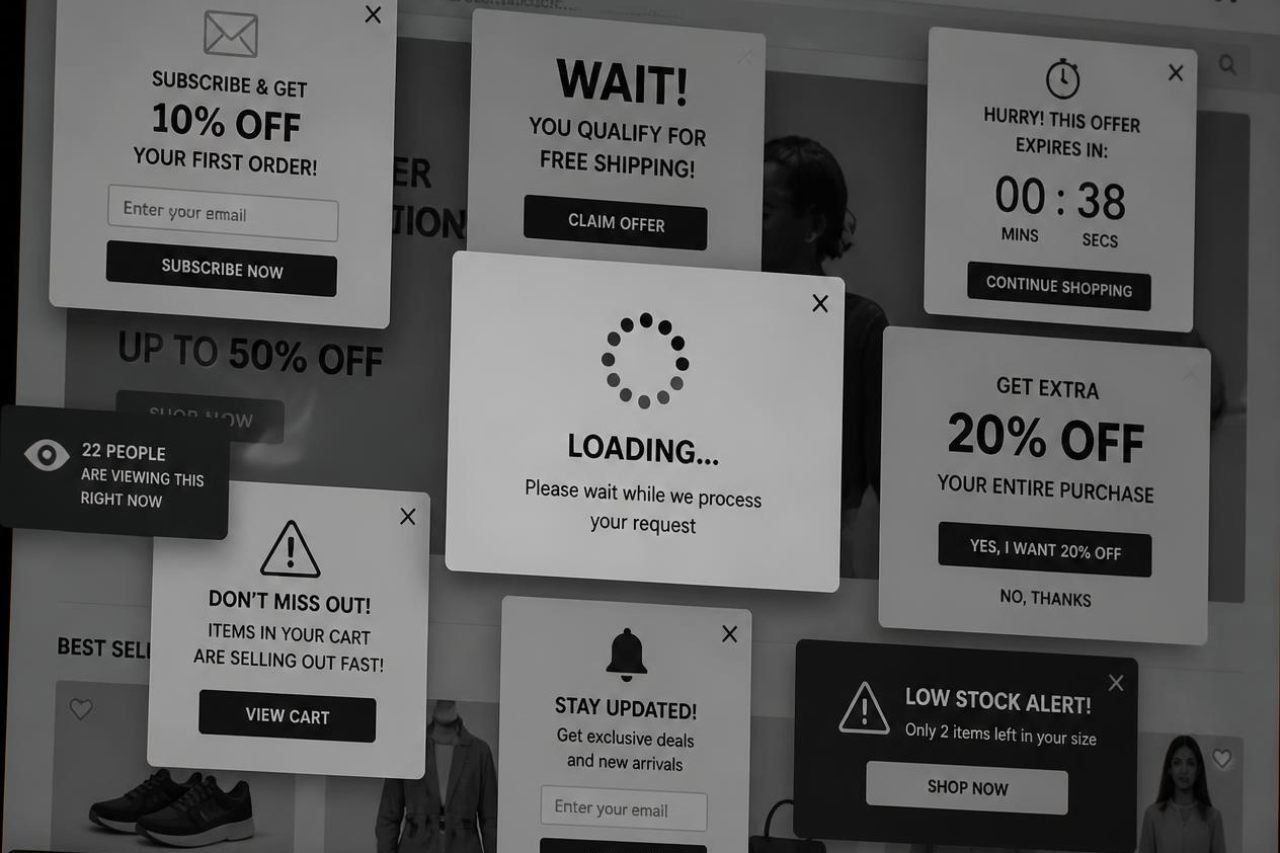
Build popups that support the user experience
A well-designed popup should appear smoothly and disappear just as easily.
Avoid layouts that shift the page after it loads, make the close button easy to find, and ensure visitors can continue browsing without friction. Unexpected movement or difficult interactions make a site feel slower and less polished.
Don’t sacrifice performance
Many popup tools load additional JavaScript, fonts, and third-party resources. Poorly optimized scripts can increase page weight and delay interactivity, particularly on mobile devices.
Audit popup apps regularly and remove features or integrations you don’t use. Every script should justify its impact on performance.
If your popup platform is slowing down your storefront, performance tools such as Hyperspeed can delay non-critical scripts, helping preserve Core Web Vitals without removing the functionality merchants rely on.
Make accessibility part of the design
Accessible popups improve usability for everyone.
Users should be able to navigate the popup with a keyboard, close it using the Escape key, and have focus move into the popup when it opens and back to the page when it closes. Screen readers should clearly announce the popup and its purpose.
These are core accessibility practices recommended by the W3C’s Web Accessibility Initiative.
Follow Google’s guidance
Google doesn’t discourage popups altogether. It discourages intrusive ones that prevent visitors from accessing the content they came to see.
Full-screen promotional popups that appear immediately after someone lands from Search create a poor user experience and can make it harder for Google to understand your page.
Instead, let visitors access the content first.
If you need to promote an offer, use a smaller banner, slide-in, or delay the popup until they’ve engaged with the page.
Google specifically recommends less intrusive alternatives that keep the main content accessible while still allowing you to promote newsletters, apps, or special offers.
Mistake #11: Measuring the Wrong Metrics
A popup can generate thousands of email signups and still reduce revenue. That’s why measuring popup success requires looking beyond opt-ins.
Measure business outcomes, not just popup conversions
A high popup conversion rate only tells you that visitors completed the form. It doesn’t tell you whether those subscribers became customers.
Instead, compare store performance before and after a popup goes live. Look at metrics such as:
| Measure | What it tells you |
| Overall conversion rate | Whether the popup improves sales, not just signups |
| Revenue per visitor (RPV) | Whether the popup increases the value of each visit |
| Bounce rate and exit rate | Whether visitors leave after seeing the popup |
| Average order value (AOV) | Whether promotions encourage larger purchases |
| Email revenue | Whether captured leads generate long-term value |
A popup should improve business performance, not just collect more email addresses.
Don’t confuse attribution with impact
Not every sale from an email subscriber was caused by the popup.
Whenever possible, compare visitors who saw the popup against those who didn’t. Running A/B tests or holdout groups helps isolate the popup’s true impact instead of giving it credit for conversions that would have happened anyway.
The best popup isn’t the one with the highest opt-in rate. It’s the one that creates the greatest lift in revenue over time.
How to Build High-Converting Smart Popups
There’s no universal popup that works for every store. The highest-converting campaigns combine the right message, the right timing, and the right format for each stage of the customer journey.
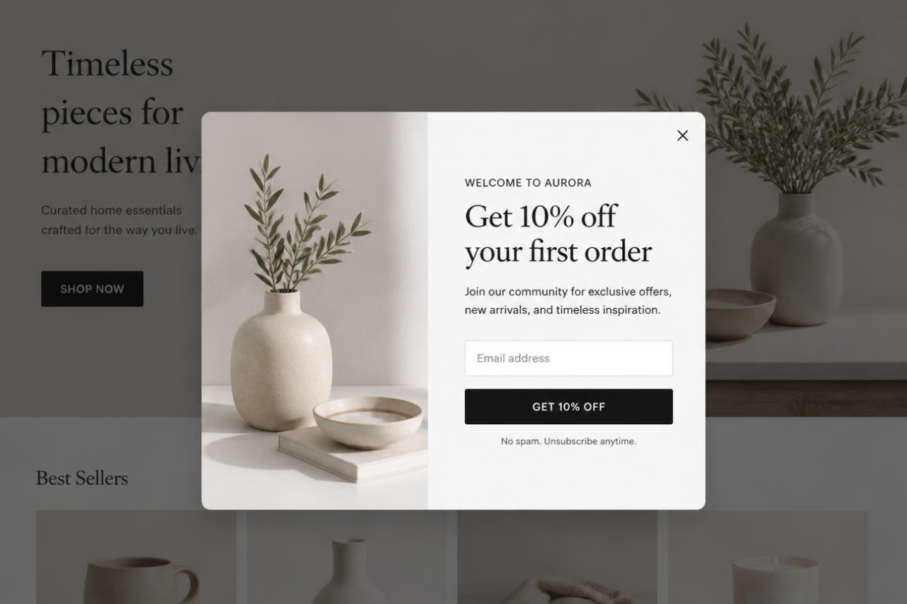
Before publishing a popup, ask yourself:
- Has the visitor shown intent? Trigger popups based on behavior, not page load.
- Is the offer relevant? Match the message to the page and the visitor’s stage in the buying journey.
- Is this the right format? Choose a modal overlay, nonmodal overlay, sticky bar, or inline offer based on how much attention the message requires.
- Is it easy to dismiss? A visible close button and mobile-friendly design protect the user experience.
- Am I measuring the right outcome? Evaluate overall conversion rate and revenue, not just popup signups.
Finally, keep testing. Customer behavior changes over time, so review popup performance regularly, experiment with one variable at a time, and remove campaigns that no longer add value.
Popup Alternatives That Sometimes Convert Better
Popups aren’t always the best way to engage visitors. If your goal is to reduce interruptions while still promoting offers or capturing leads, these alternatives are often a better fit.
| Alternative | Best For |
| Nonmodal overlay | Sharing announcements or promotions without blocking the page. |
| Sticky bar | Promoting free shipping, sitewide sales, or limited-time offers that stay visible while visitors browse. |
| Inline content | Displaying buying guides, product recommendations, or downloadable resources naturally within the page. |
| Embedded newsletter signup | Capturing email subscribers from visitors who are ready to opt in without interrupting their browsing experience. |
| Slide-in | Presenting contextual offers after visitors have engaged with the page without taking over the screen. |
The best solution depends on your objective. If the message isn’t urgent, a less intrusive format often delivers a better user experience while still supporting lead capture and conversion goals.
The Bottom Line: Great Popups Feel Helpful, Not Interruptive
Popups remain one of the most effective tools for lead capture and conversion optimization, but only when they’re designed around the customer, not the campaign.
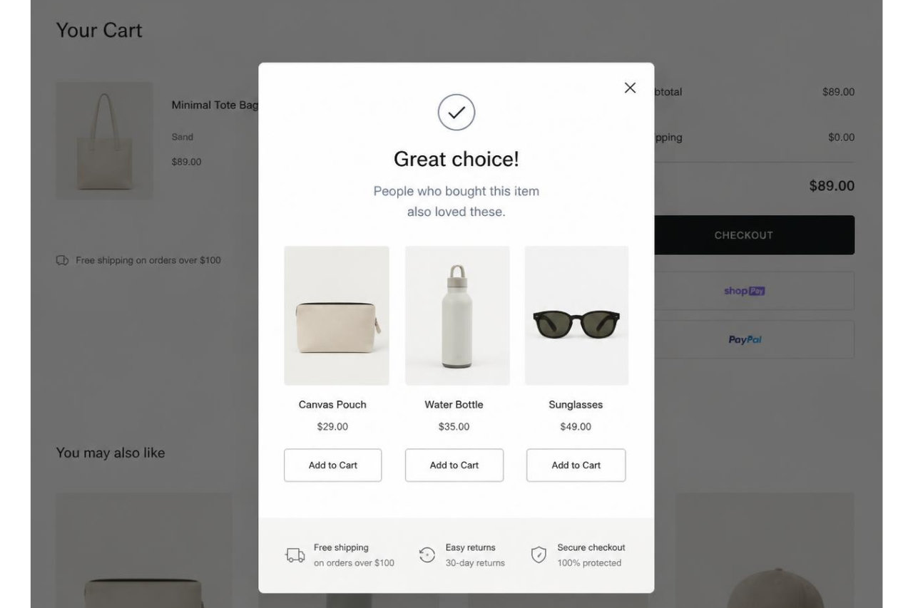
The highest-converting popups don’t appear more often. They appear at the right moment, deliver something relevant, and respect the visitor’s experience. That means choosing the right format, limiting interruptions, keeping forms simple, and measuring success by business outcomes instead of signup numbers.
If every popup earns its place on the page, it stops feeling like a marketing tactic.
Before adding another popup, make sure your store is fast enough to support it. Even the best popup can’t recover conversions lost to a slow storefront. Running a performance audit can reveal whether your popup strategy is helping customers or simply adding more friction.
Compare how fast your store is to a huge sample of other stores. Get benchmarked and find out where you can improve your speed to make more sales. How fast is your Shopify store?
FAQ
Do popups still work for increasing conversion rate?
Yes, popups still improve conversion rate when they’re shown with the right popup timing and a clear call to action. Trigger them after meaningful engagement, such as a timed delay or scroll, instead of immediately on page load, to improve user experience and reduce interruptions.
What’s the best popup type for ecommerce stores?
The best popup depends on the goal. Use exit-intent popups to recover abandoning visitors, a scroll-triggered popup after visitors engage with content, a click-event popup for product information, and a nonmodal overlay for announcements that shouldn’t interrupt browsing.
Should every popup offer a discount?
No. A promotional offer works for some shoppers, but many respond better to a content upgrade, buying guide, or exclusive newsletter signup. Matching the offer to visitor intent improves lead capture, protects margins, and creates a better user experience than relying on discounts alone.
Can popups hurt SEO and website performance?
They can if implemented poorly. A heavy modal overlay or intrusive overlay may slow pages, disrupt critical tasks, or block content on mobile. Keep popup scripts lightweight, make the close button easy to find, and prioritize accessibility to support both SEO and conversion optimization.
How do I know if my popup is actually working?
Don’t judge success by email capture alone. Measure overall conversion rate, revenue, bounce rate, and user engagement, then validate changes with A/B testing. The best smart popups increase sales while improving the shopping experience, not just collecting more email addresses.